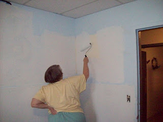
The first step was to put primer over the existing decor.
 These don't look quite as bad in these pictures as they did in person. The lines were very thick and messy. Especially the Tigger that is cut off on the right side of this picture.

 The bottom of the walls was covered in a marble sheeting of some sort. We had to use special primer that would cover shiny surfaces. This picture also shows the original location of a cabinet they moved to the other side of the room.
 These don't look quite as bad in these pictures as they did in person. The lines were very thick and messy. Especially the Tigger that is cut off on the right side of this picture.
 The bottom of the walls was covered in a marble sheeting of some sort. We had to use special primer that would cover shiny surfaces. This picture also shows the original location of a cabinet they moved to the other side of the room.


3 comments:
The nursery looks so much better now!
Dad
The previous "decor", the horrible attempt at Winnie the Pooh characters was pretty bad! It looks much better. Though, I think you need some clouds in the sky. :)
Rachel
We were thinking of doing clouds, too. You can't really see the little "v" birds in the sky in the pictures, either.
Post a Comment